Tuesday, December 17, 2013

#05 - Some Activities

This is our activity about Business Cards. The only note is that some of the informations written in the business cards may not be real but don't even try to memorize it.


#1 - It is readable even it is printed in smaller sizes and farther. It is almost black and white but with red, blue, and yellow.


#2 - This one is same as the first one. Still readable in smaller parts. This one is black and white and I changed the positions of the text and the rectangular background.


#3 - This one is something difficult to see than the previous two. This is related to the first one I made but the differences are the background---I made it orange---and reversed the blacks and whites from the first one. Well, as I said that this one is so difficult to see. But I made it to see some differences.


Tuesday, December 3, 2013

#04 - Understanding Color Spaces

Day four in Principles of Design and Color Theory class. Today is understanding about Color Spaces.

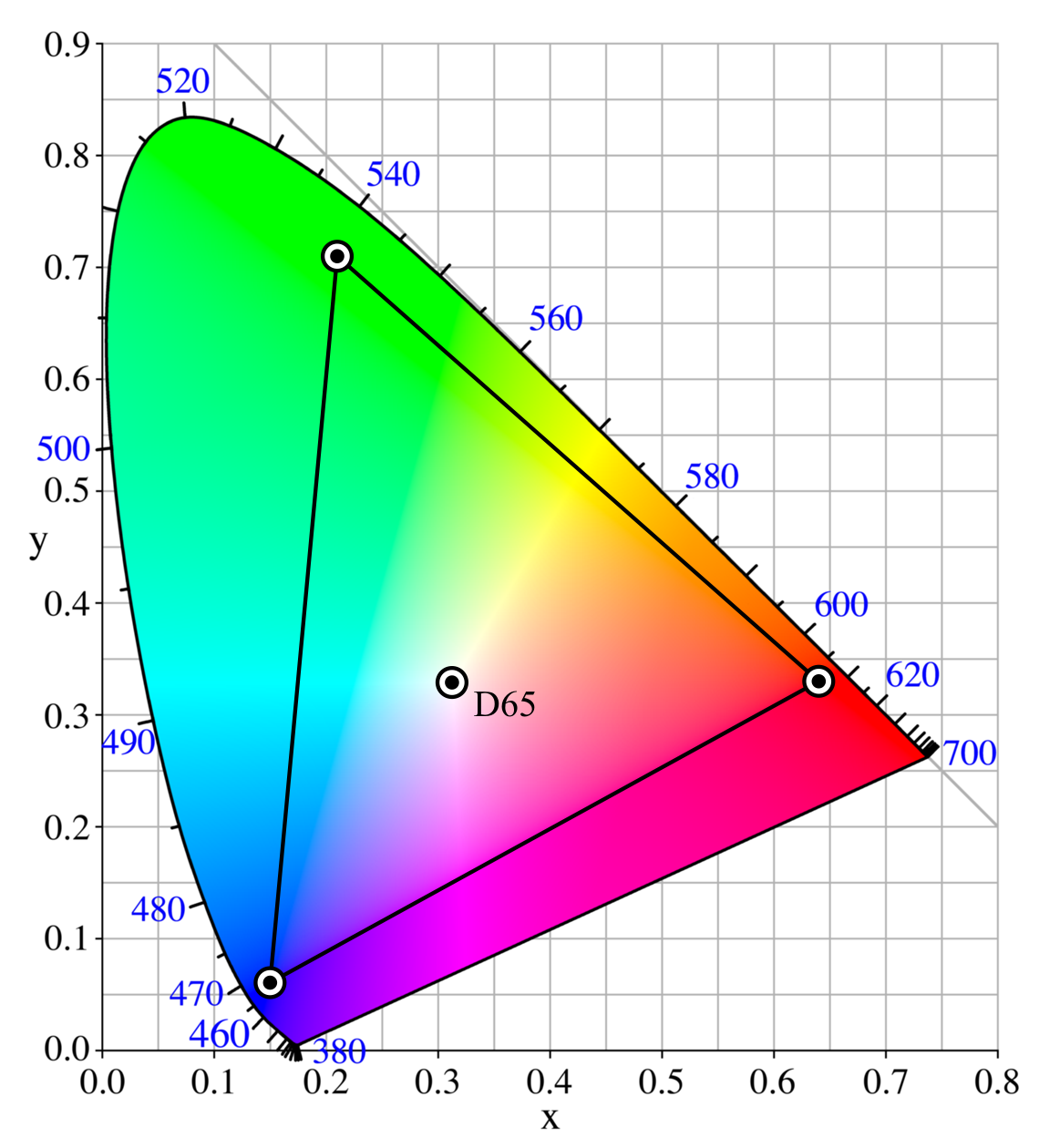
A figure of known Color Settings.

These are the five of the best known color spaces:

  • ProPhoto RGB
  • Adobe RGB 1998
  • sRGB
  • CMYK
  • Lab Color Space


ProPhoto RGB
--- The ProPhoto RGB is an output referred RGB color space. It is developed by Kodak. It offers an especially large gamut designed for use with photographic output in mind. This encompasses over 90% of possible surface colors in the CIE L*a*b* color space, and 100% of likely occurring real world surface colors making ProPhoto even larger than the Wide Gamut RGB color space. This primaries were also chosen in order to minimize hue rotations associated with non-linear tone scale operations. One of the downsides to this color space is that approximately 13% of the representable colors are imaginary colors that do not exist and are not visible colors.


Adobe RGB 1998

--- The Adobe RGB color space is an RGB color space developed by Adobe Systems in 1998. It was designed to encompass most of the colors achievable on CMYK color printers, but by using RGB primary colors on a device such as the computer display. This encompasses roughly 50% of the visible colors specified by the Lab Color Space as well as improves upon the gamut of the sRGB Color Space, primarily in cyan-greens.


sRGB

--- The sRGB is a standard RGB color space created cooperatively by HP and Microsoft in 1996 for use on monitors printers and the Internet. It uses the ITU- BT.709 primaries, the same as are used in studio monitors and HDTV, and a transfer function (gamma curve) typical of CRTs. This specification allowed sRGB to be directly displayed on typical CRT monitors of the time, a factor which greatly aided its acceptance. Unlike the other RGB color spaces, the sRGB gamma cannot be expressed as a single numerical value.


CMYK

--- The CMYK is a subtractive color model used in color printing and it is also used to describe the printing process itself. This refers to the four inks in some color printing: Cyan, Magenta, Yellow, and Black. Though it varies by print house, press operator, press manufacturer, and press run, ink s typically applied in the order of the abbreviation. The "K" in CMYK stands for key because in four-color printing, they are carefully keyed or aligned. It may be derived from the last letter of the word "black" because of being the last letter of the word black is "K".


CIELAB color space

--- The CIELAB (CIE L*a*b*) color space is a color-opponent space with dimension L for lightness, and a and b for the color-opponent dimensions. This was defined by the Comission Internationale de l'Eclairage (CIE). In 1931, CIE defined the CIE XYZ color space, which represented all possible colors based on human perception. Like RGB, CIE XYZ has three orthogonal dimensions however XY&Z do not correspond to real colors. They are simply mathematically convenient with Y carrying the luminance information. CIE is usually represented by a 2D "chromaticity diagram" obtained from the CIE XYZ model. The CIE XYZ model and chromaticity diagram are the perceptually uniform. A more uniform version of CIE defined in 1976, officially known as CIE L*a*b*. "L" stands for luminance and again light. "A" stands for the red-green axis. And, "B" stands for the blue-yellow axis. The asterisks were added to differentiate CIE from another L,a,b model.


What I understand most:

  • In Lab color space, it is entirely the colors present in the human world, all colors what I see I think.
  • The CMYK are for printing.
  • The sRGB are standard computers used for monitors and mostly in the internet.
  • The Adobe RGB of 1998 are somehow its colors are successful in CMYK.
  • The ProPhoto RGB are from photographs.
I understand a lot and it helps me a lot in exploring and learning colors.

Tuesday, November 26, 2013

#03 - Learning Basic Design Concepts

In learning Basic Design Concepts, I've learned about the Composition, the Rule of Thirds, the Fibonacci Spiral, and the Golden Ratio. The Composition is the arrangement and sequence of objects in visual artwork. The Rule of Thirds is a compositional rule of thumb that divides into 3 parts horizontally and vertically. The Fibonacci Spiral is very well when used in drawing. And the Golden Ratio is the alignment of artworks in 1:1.618 ratio.


This is my activity for the Rule of Thirds.


Here’s one of my works. I made the tower in the center and that leaves the blue part on the top when it is divided into 3 equal parts horizontally. Here’s my second work:


Just like the first one, I simply made it looks like divided into three parts horizontally. The bottom part is the soldier (due to his outfit) and the burning houses. The center part leaves the center part which is full of black and little flames. And, the top part is the titan is about to breach the wall.


Here’s my third work. I cropped the image with the Rule of Thirds to focus the sun in the center of the image.


This is just like my third work. Well, just focusing the light or the sun in the center.


Now, my fifth work and the last work for Rule of Thirds. The original (which is in the “before” side) is actually in the Rule of Thirds in one shot of a picture. I just decreased the size and both looks better.

And now, this is my work for facial Golden Ratio:


I tried a facial shot of Hayden Christensen as Anakin Skywalker of Star Wars. The facial Golden Ratio is almost going to be exact on his face (when he face straightly).

Tuesday, November 19, 2013

#02 - Learning in Basic Photoshop Settings

Here in the second day in Principles of Design and Color Theory. Today, I've learned a lot of things about learning Adobe Photoshop settings and this is also my first time going in the settings of Photoshop. I've also learned why is it so important in every Multimedia Artists, professional or not, from all over the world. Well, I'm using Adobe Photoshop CS6 and I'm just a beginner for using Photoshop.

What have I learned?
All of the things I've learned today are listed below:
  • First thing of all, for resetting settings:
  • In General Preferences, they are all default and the only thing I've changed is the Zoom with Scroll Wheel. After enabling that option, I tried it and it feels a lot easier in zooming my work every time in Photoshop. I've been also understanding Nearest Neighbor and Bicubic. I've been working with choosing these two interpolation.
  • In Interface Preferences, it is just the outside beyond the working area. If you want to have a black background than gray, so be it. It is very simple by the way.
  • In File Formatting Preferences, I just learned about the kind of file should I use and the data of the saved file.
  • In Performance Preferences, this is the most interesting part I've learned today. This is just setting the Memory Usage, History & Cache, Scratch Disks, and GPU Settings. In this part, I've learned which kind of computer should I use while working in Photoshop and in all programs, a computer with a very high RAM like 8GB RAM, a 64-bit Operating System, and a video card with a very high performance for Photoshop, Premiere Pro, and After Effects editing, and doing 3Ds.
  • In Cursors, well, it is just the kind of cursor I wanted to be in while working.
  • In Transparency, I've learned the output of the empty part of the project space of an image. 
  • In Units & Rulers, this is also one of the most interesting part I've learned. In Units, I do want to use inches so I got how. By the way, Document Preset Resolutions are lot important to me in Photoshop. I've been basically using Photoshop in 72dpi. Well, I used 300dpi in a project recently during the 1st semester. And I observed and learned the difference between 72dpi and 300dpi: The appearance when they're printed. I can work on both depending on what kind of project I wanted to do.
  • In Guides, Grid & Slices, I've learned about the colors I wanted to use in Guides, Smart Guides, Grids, and Slices. It is just changing colors and nothing else. It also purposes on a guide with the same color as a project.
Everything I've learned is really important in my career because that will guide me on working with proper and care, and to have no mistakes done.

Tuesday, November 12, 2013

#01 - My First Day in Principles of Design and Color Theory

1.) What is this subject and who is teaching this subject?
The subject's name is Principles of Design and Color Theory. This subject is one of the major subjects for Bachelor of Arts in Multimedia Arts (ABMMA). This subject talks about the different designs that a student should learn and make, and also talks about the color theory which is about the different colors exist. And, the professor who teach students in this subject is Mr. Rey Mendoza.

2.) What have I learned today?
The things that I've learned today in this subject is about how things will begin, make, and finish a project that will result a good outcome. I also learned about being more careful in making projects because I've answered the questions with bad outcome. Not so bad enough because this helps me to overcome my mistakes and do things that will always right and good. The professor showed a lot of his works (like a web-paged-360-degree view of a place such as inside a room, an occasion, and a landmark) and I'm really very impressed because there are things in Multimedia Arts that I can't do in my current level today.

3.) What are my expectations for this subject?
I got a lot of things I'm expecting for this subject:
  • This subject, and especially other subjects, is going to be very interesting, a lot.
  • I'm going to learn a lot from this subject that will guide and help me a lot in the things I'm doing now and in my career after college.
  • I'm also expecting to do a lot of activities/projects in this subject to make me prove what have I learned from this subject.
  • Forcing myself to be present always so I won't miss any teachings done by this subject. It is purely obvious to everyone about this.
  • Learn to be more careful.
  • Overcome mistakes.
Thanks for reading and have a nice day! :)